Designs
Information About The Artist
|
Summary
Ed Fella is an American Graphic Designer Born in 1938 in Detroit, Michigan and is also an artist and educator. Edward Fella does a lot of typography when taking his photographs and is widely known to break a lot of rules in typography and other designs. His style that he used was very successful and granted his art into multiple art museums such as Cooper-Hewitt, National Design Museum, the Brauer Museum of Art, and the Museum of Modern Art.The style that he used was unique to him at the time it was slightly based on the theory of deconstruction, but he took that and pushed it even further. He has also been given awards for his art such as the 2007 AIGA Medal and the Chrysler Award in 1997. |

|
Life story
Edward Fella was born in Detroit, Michigan in 1938. Ed Fella was in a middle-class family and attended Cass Technical High School,a magnet school in Detroit where he studied a number of subjects such as lettering, illustration, paste-up and other commercial-art techniques.
After that in 1957 he graduated from Cass tech and after that went into the commercial graphic industry where he would work in the industry for 30 years. From finishing his time in the commercial graphic industry e then went onto study at the center for creative studies and graduated from there in 1985. After Ed Fella graduated he then went to Cranbrook academy of art and graduated from there in 1987 and then began teaching at California institute of Art.
Style
Edward Fellas style is very unique to him and breaks a lot of rules in typography and design to have his great, new and unique designs to come to fruition. His style wasn't like this all the time as he had a style that was unique to him at the time, it was slightly based on the design idea of deconstruction, but he took that and pushed it even further to create his great designs he does now.
To have the style of Edward A demonstration of it would be by distorted a style of sanserif with his own hand writing with various thicknesses, curves, and tails to each character so that each one is different from the one before.
Analysis
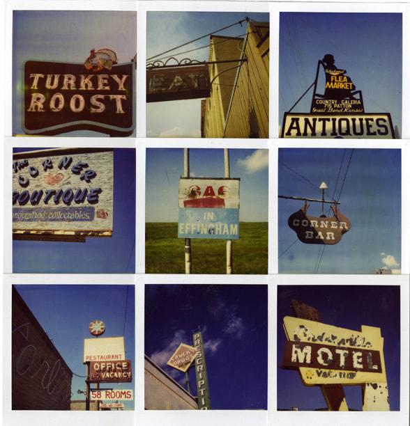
From observing Edward Fellas different designs of typography I can see the trends in his work and things that create a great design. One of the main things that Ed uses is that he has a similar colour for each picture in the design which makes them work well together and adds an atmosphere to them.
An example of this is when he would use mostly dark pictures to create a spooky and disturbing feel to the design, contrasting to a design where he would use mostly bright colours and vibrant ones to show a happy and wonderful feeling, but as you look more into the image you see a different feeling, as the signs with the names of bars and restaurants are rusted, broken and old making it seem more sad and depressing then happy. Giving the impression that things are not all what it seems and can have a false impression then what they're really are.
Dark image Light image
Edward Fella was born in Detroit, Michigan in 1938. Ed Fella was in a middle-class family and attended Cass Technical High School,a magnet school in Detroit where he studied a number of subjects such as lettering, illustration, paste-up and other commercial-art techniques.
After that in 1957 he graduated from Cass tech and after that went into the commercial graphic industry where he would work in the industry for 30 years. From finishing his time in the commercial graphic industry e then went onto study at the center for creative studies and graduated from there in 1985. After Ed Fella graduated he then went to Cranbrook academy of art and graduated from there in 1987 and then began teaching at California institute of Art.
Style
Edward Fellas style is very unique to him and breaks a lot of rules in typography and design to have his great, new and unique designs to come to fruition. His style wasn't like this all the time as he had a style that was unique to him at the time, it was slightly based on the design idea of deconstruction, but he took that and pushed it even further to create his great designs he does now.
To have the style of Edward A demonstration of it would be by distorted a style of sanserif with his own hand writing with various thicknesses, curves, and tails to each character so that each one is different from the one before.
Analysis
From observing Edward Fellas different designs of typography I can see the trends in his work and things that create a great design. One of the main things that Ed uses is that he has a similar colour for each picture in the design which makes them work well together and adds an atmosphere to them.
An example of this is when he would use mostly dark pictures to create a spooky and disturbing feel to the design, contrasting to a design where he would use mostly bright colours and vibrant ones to show a happy and wonderful feeling, but as you look more into the image you see a different feeling, as the signs with the names of bars and restaurants are rusted, broken and old making it seem more sad and depressing then happy. Giving the impression that things are not all what it seems and can have a false impression then what they're really are.
Dark image Light image

|
|
Personal Opinion on Ed Fellas Photography
My opinion about Ed Fellas Photography is that its very unique, and great to look at and find the interesting parts of the pictures. I do think that it does get a bit repetitive since they're all very similarly structured, but because Ed Fella thinks about the location and the setting for his photos it makes each one more special.
If I where to change a part of his method of designing i would try have the layout of the photographs a bit different each time, maybe some different sizes and some maybe clashing with others.
