
|

|
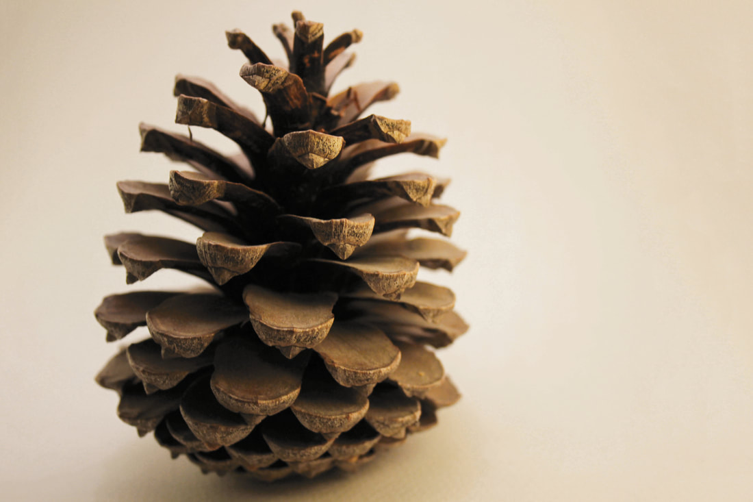
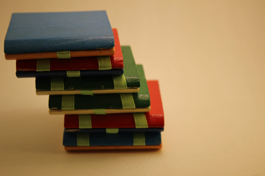
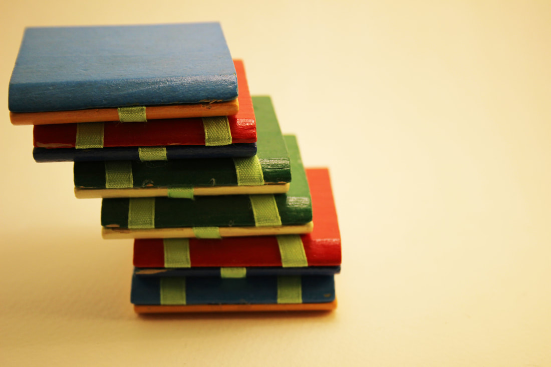
When editing this photograph and many others I would crop the parts where it goes off the light box to add more of a clean look to the photograph ,and have it focusing on the object more. I did this by using the fill option in Photoshop for this photograph.
|
Next I made the lighting look less warm and more natural lighting by increasing the brightness on the image. I would then decrease the contrast so the image still looked more unedited and natural.
Some parts of the image that where still dark and more of a warm colour I would then go over with a brush using the same colour as the rest of the image. This made it blend in with the rest of the image. I did all of this in Photoshop and this will be one of my final photographs that I will pick. |
|
|

|
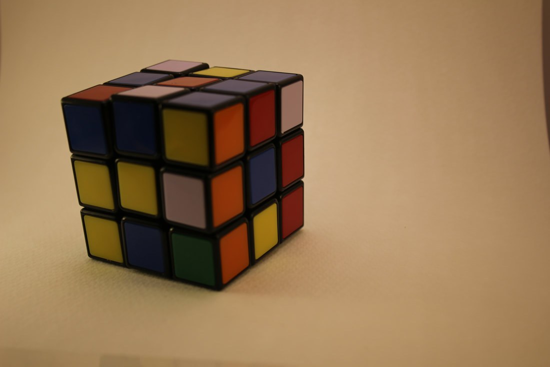
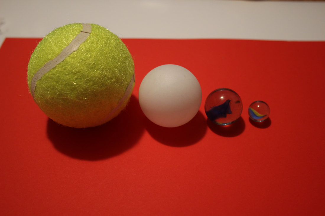
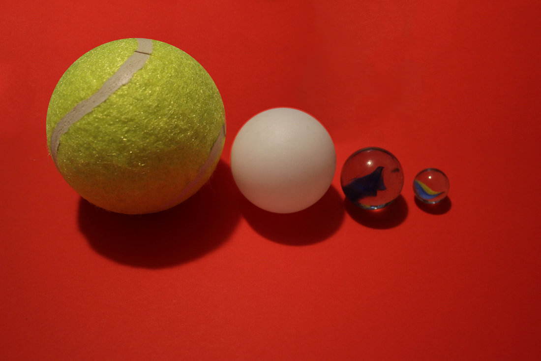
For this photograph I edited out the part of the photograph in which it goes off the light box. This issue is with most of my photographs and happens because the light box that I have created is too small for the objects I would like to take photograghs of, to avoid this in the future I could create a bigger light box.
I edited out the part in the top right which goes out of the light box by using the fill tool in Photoshop, which makes the area which I select blend in with the rest of its surrounding more. This removed the part i didn't want and made the photograph look more clean.
|
After I edited out the part I didn't want I then tested the Photograph with different colours to see if it would make the photograph maybe more interesting or more appealing to look at.
First I used the colour balance tool to change the overall colour to purple, this makes the photograph stand out more and makes it more engaging. I then changed it to look more vibrant by using the vibrance tool which let me increase or decrease how vibrant I want the photograph and the saturation of it. I increased the vibrance and this made the colours in the rubix cube pop out more as well as the purple background. |

|
|
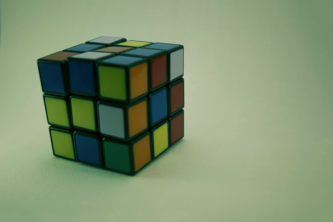
I then tried to create another one using different colours to experiment and see how it would look.
For this photograph I changed the colour balance like the other photograph by using the colour balance tool which I used to make the overall image a Turquoise colour. This made the image more gripping but seemed too dark and hard to see the rubix cube so I used the Brightness/contrast tool which let me increase the brightness and make the image more visible and appealing. |

|

|
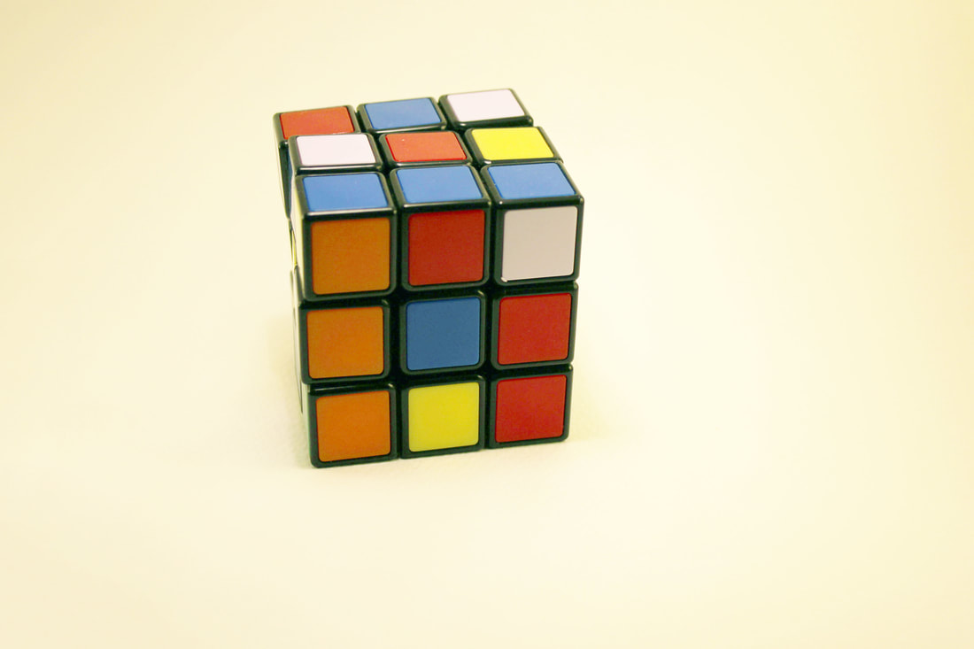
For this image I did what I did for the other photographs and removed the parts outside of the light box by again using the fill tool but the image still seemed too dark and a very warm colour so I would then try using Photoshop to increase the brightness and crop the unnecessary parts of the image.
|
|
|
|
|
